The Choice Group field allows a user to select one or more options from a range of text values.
The Choice Group control provides a number of options that control the style of the selection widget (e.g. popup menu, radio buttons, switches and checkboxes) and the selections a user can make.
The following screenshot illustrates the configuration of a Choice Group, including the three available options:
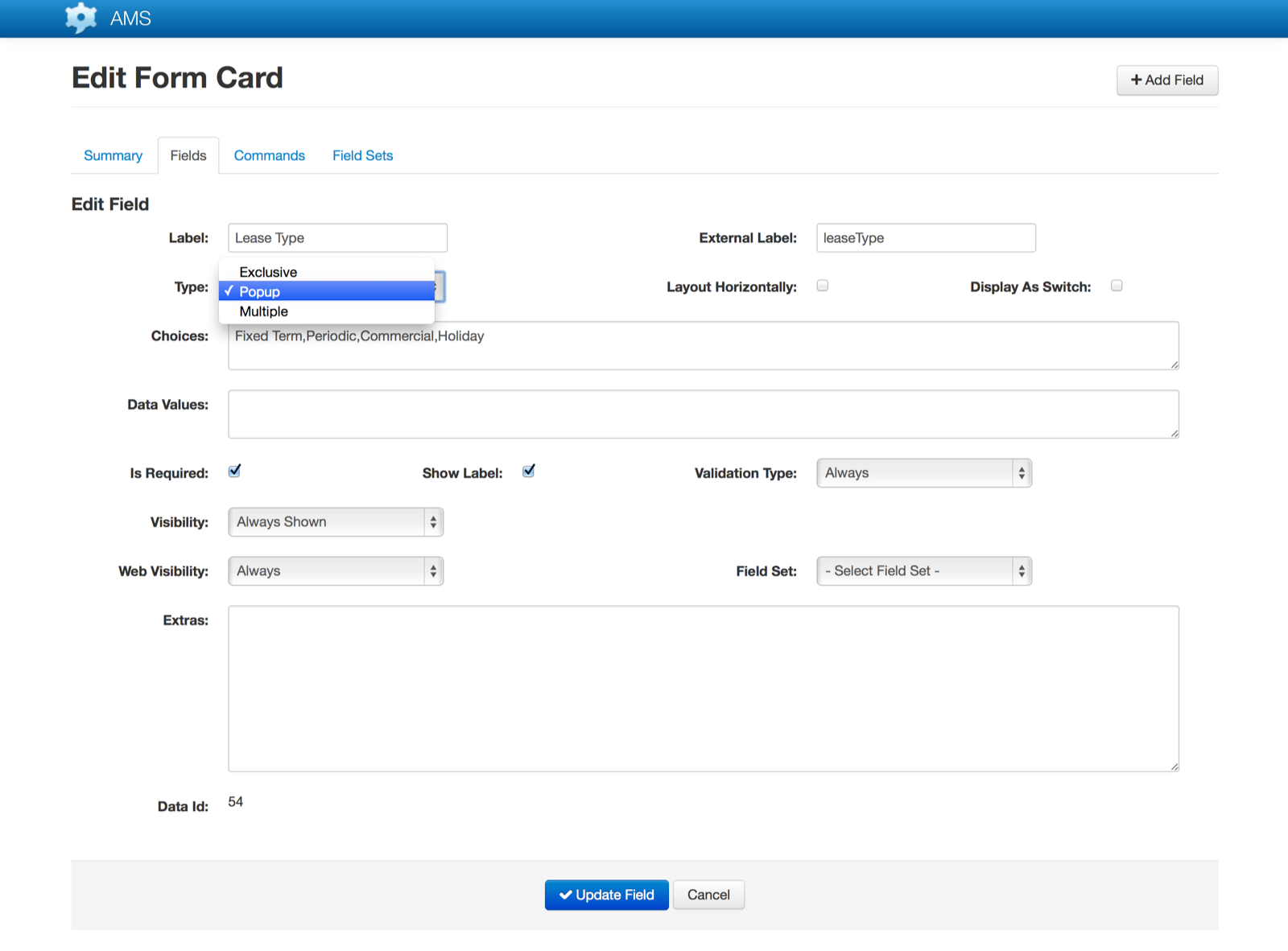
Choice Type
| Description | Attributes |
|---|---|
| Exclusive | The user may select only one item from the available choices. This is effectively a radio button style control, with all available options visible at all times and a coloured icon identifying the currently selected item.Selecting an item will have the effect of unselecting any currently selected items.The following screenshot illustrates an Exclusive type Choice Group control (Samsung device, v4.4.2): 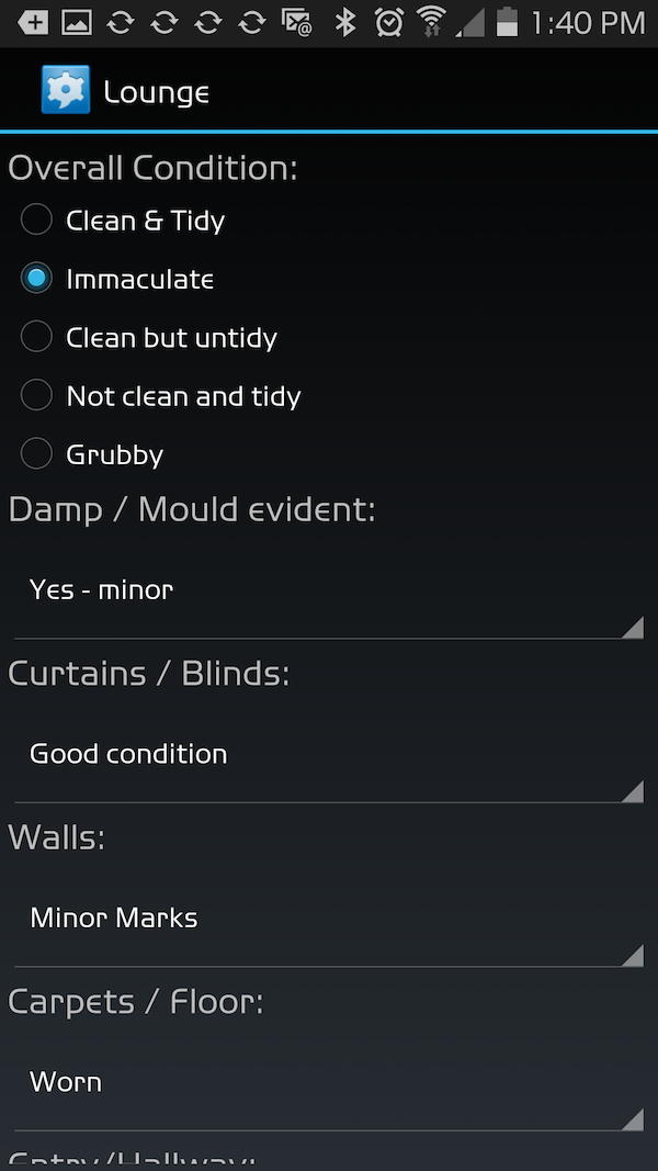 |
Multiple | The user may select one or more items from the available choices. This is effectively a checkbox style control, with all available options visible at all times and a coloured icon identifying the currently selected item(s).
Selecting an unselected item will select that, in addition to any other items already selected. To unselect an item the user will touch the item a second time.
The following screenshot illustrates a Multiple type Choice Group control (Samsung device, v4.4.2): 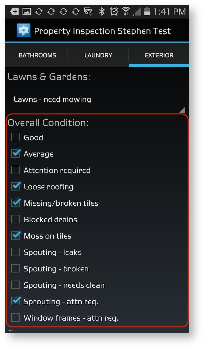
Popup | The user may select one item from the available choices. This is effectively a drop-down list box style control, with the selected item visible at all times, and the full list of available options only visible when the list is selected.
Selecting an item will have the effect of unselecting any currently selected items.
The following screenshot illustrates an Popup type Choice Group control when it is in the selected state (Samsung device, v4.4.2): 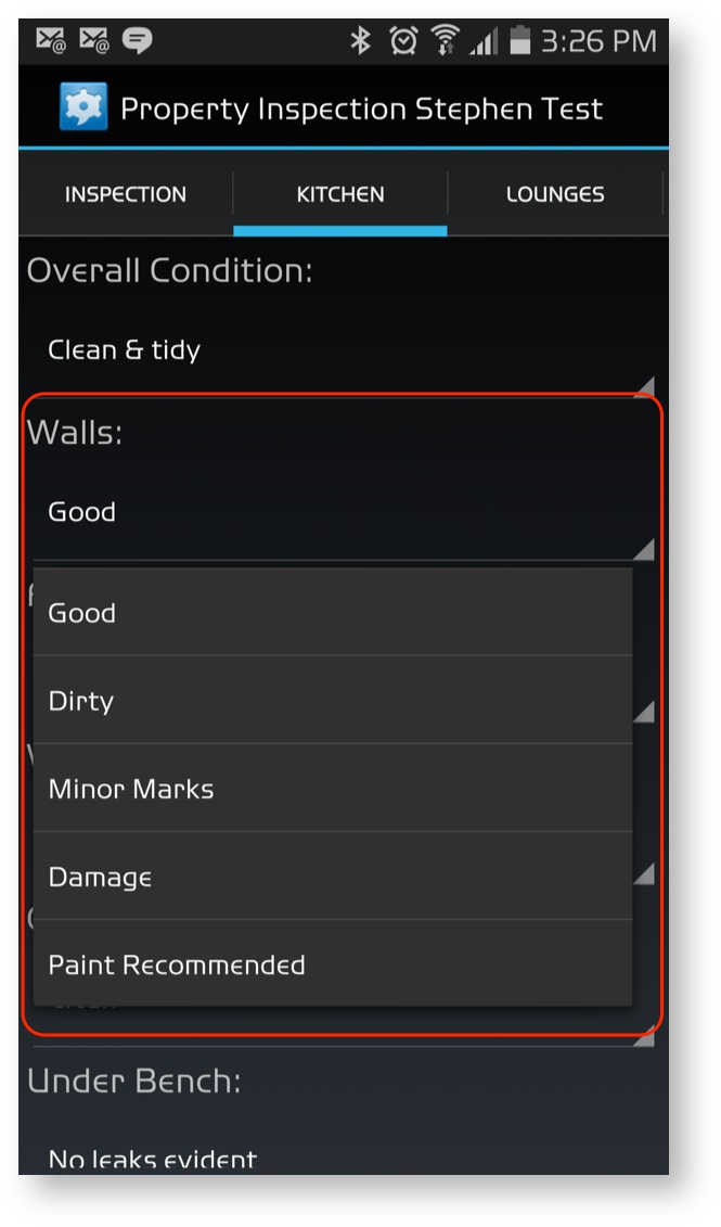
Settings
| Item | Description |
|---|---|
| Label | The name of the field that will appear on the screen. |
| External Label | The name of the field when used in XML, Word Document Mail Merge etc |
| Type | Popup: Displayed as popup menu or single selection list. Single selection allowed. Exclusive: Displayed as radio buttons, switch, single selection list or popup menu. Single selection allowed. Multiple: Displayed as checkboxes or selection list. Multiple selections allowed. |
| Choices | A comma separated list of words e.g. ‘one,two,three’. Each item in the list becomes an option. To create choices that contain commas wrap (delimit) each choice in square brackets i.e. [ ]. For example: ‘[low, medium],[high]’ will produce two options: ‘low, medium’ and ‘high’ |
| Layout Horizontally | For Exclusive fields on Android devices only, this changes the layout of the radio buttons from vertical to horizontal. This setting is ignored on platforms other than Android. |
| Display As Switch | This setting causes an exclusive choice group field to display as a switch. The field must only have two options otherwise it will display as a normal exclusive choice group field. The first option will become the positive or ‘on’ position for the switch and the second the negative or ‘off’ position for the switch. Since a switch must always have a value, the default is the negative, ‘off’, option. |
| Is Required | Determines if a value must be set for this field. |
| Validation Type | If the field is required this setting determines if it is always required or only when visible. |
| Visibility | Set the visibility options for the field. |
